Applying Gestalt's principles to content design
The human brain is wired to find structure and patterns in what we see. This doesn’t just apply to design; the way we form our sentences and create familiar layouts makes it easier for users to understand content.
Using patterns, we can process the information we gather more quickly and efficiently. From an evolutionary perspective, patterns would have saved the lives of our homosapien ancestors by giving them the ability to recognise and quickly pre-anticipate threats and danger. Patterns make it easier and quicker for us to make sense of the world.
This cognitive process means our brains turn individual, unrelated elements into neater, more understandable patterns and shapes.
These visual shortcuts have been classified by Gestalt's principles of visual perception. These psychological principles give us the power to understand how to hold the user’s attention and improve how we communicate with them.
A quick caveat; I haven't used every Gestalt principle, as I do not think all of them apply. I have, however, taken the most relevant laws and imagined their application through a content design lens.
Elements that are visually connected are perceived to have more of a relationship than elements with no connection. It sounds obvious, but the smallest visual changes can connect completely separate images.
For content design, we should consider how:
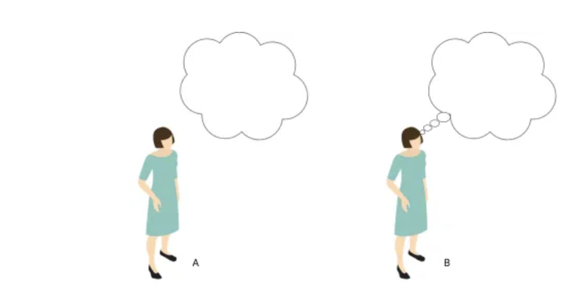
This theory applies when our brain literally fills in the gaps, to create a familiar pattern. We try to match what we see, to something stored in our memory. When there isn’t an exact match, we find a near match, then fill in the blanks to make it what we think we should be seeing.
For content design, this could mean:

We prefer things that are simple, clear and ordered. Instinctively, these things make us feel safer, and take less time to process.
For content design, this could mean:
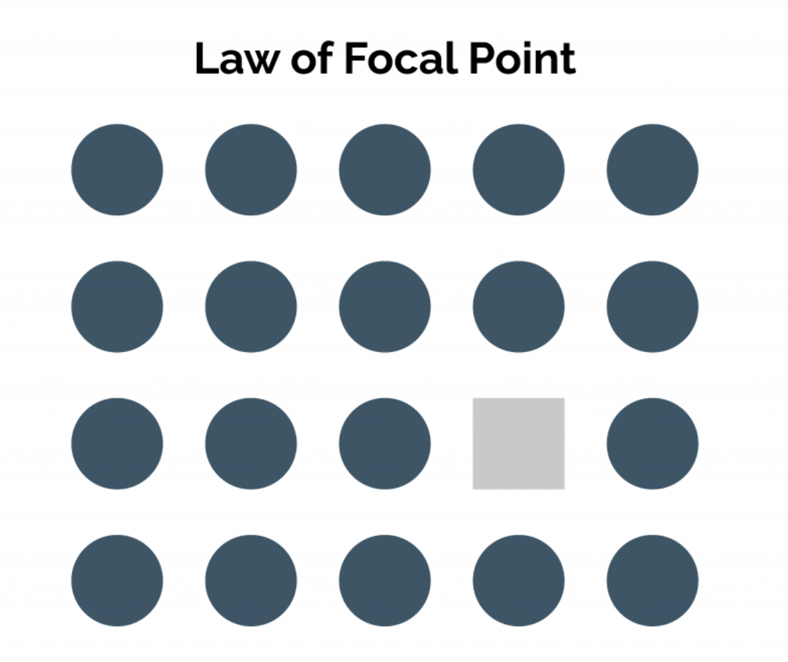
Elements with a point of interest, emphasis or difference will capture and hold the user’s attention.
For content design, this could mean:
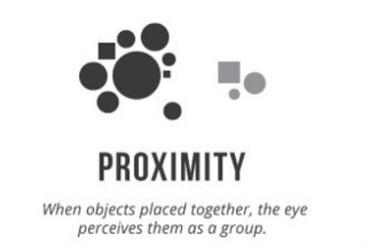
Objects that are closer together appear to be connected; to be a group, rather than individual items. They don’t need to be similar, they just need to have a proximity relationship.
Content wise, think content hierarchy. What information is related on the page? How will the flow of the page’s content impact the user’s experience and comprehension?
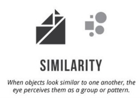
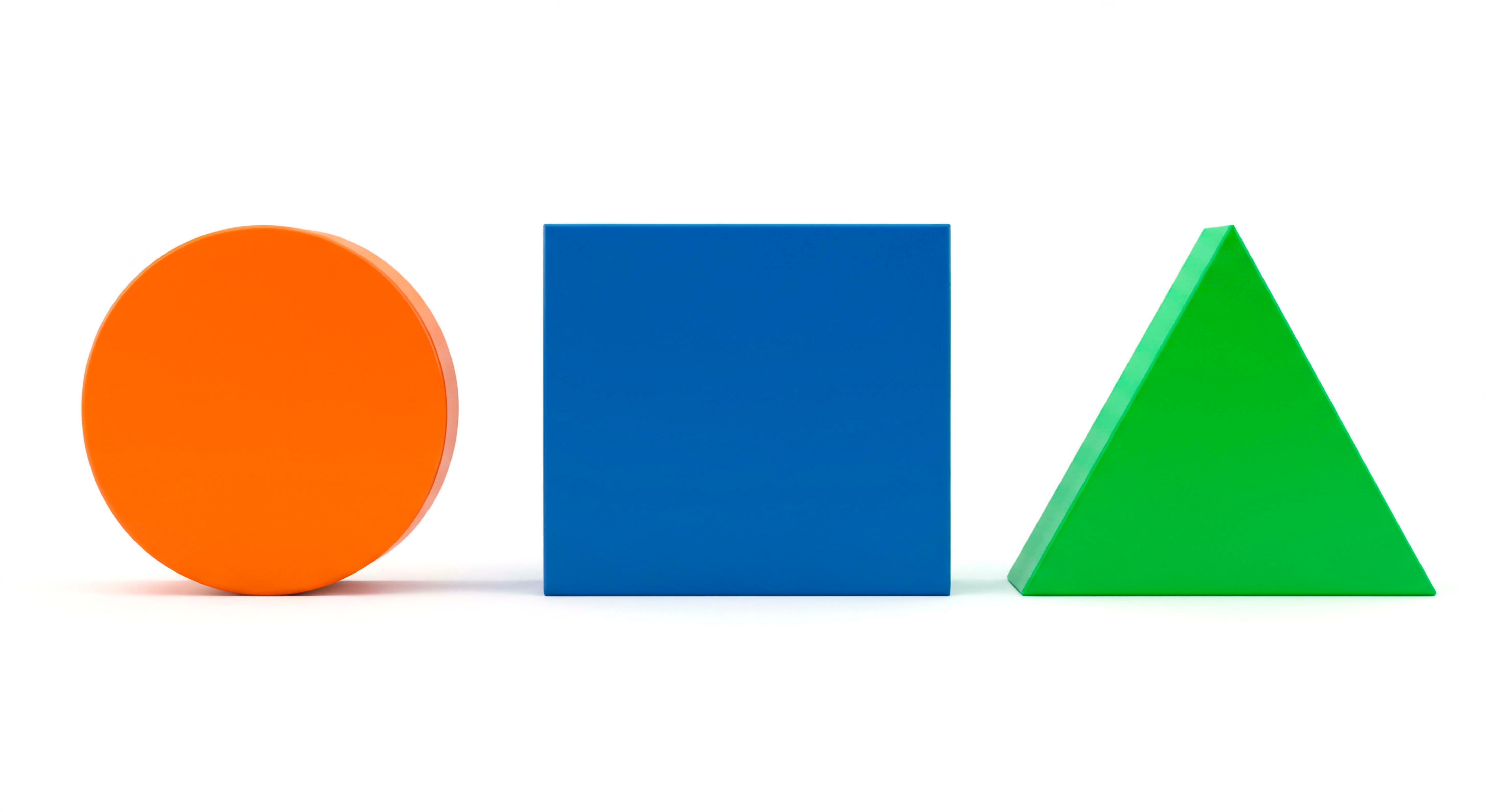
Elements that share similar characteristics are perceived as more related than those that don’t. .
It is our nature to impose order on chaos. Symmetry provides us with a feeling or solidarity and order, because it helps us make sense of what we see.
I think these two relate nicely to the way users read. Our brains are very adept at skim-reading, which is made possible by finding patterns in the formation of words and sentences. Fixations and saccades are visual cues for skim reading, often allowing us to recognise words without having to process every letter. Our brains fills in the gaps and use the context of the sentence to make an informed guess.
This, as you can imagine, can be risky. A good example is contractions. The Government Digital Service (GDS) highly recommends avoiding contractions, as it’s easy to misread things like ‘does’ or ‘doesn’t’, or do and ‘don’t’, with potentially serious consequences for the reader.